7 Bathroom Design Trends Home Buyers Want to Flush Away
7 Bathroom Design Trends Home Buyers Want to Flush Away

Homeowners love their bathrooms. We totally get it—you spend a decent amount of time in there, and you want it to be the ultimate Zen oasis. And since potential buyers want that, too, you’re likely willing to splurge to make your lavatory lush and plush.
But one person’s lush can be another’s flush—as in flush away that weird or ugly bathroom decor before it drives you insane, or would-be buyers straight to another home.
No matter how lavish you think your loo is, beware of the design trends that will simply make buyers turn up their noses. And your bathroom doesn’t have to be a lime-green, laminate horror show to turn off buyers; there are some more subtle design trends that can also cause buyers to take a pass.
So before you take the plunge, assess these seven trends that design experts and home buyers would like to flush from the bathroom right now.
1. The all-white box

Stark white kitchens and baths have been a huge trend over the years, but their time in the spotlight is mercifully coming to an end, reports Tonya Bruin, CEO of To Do–Done Handyman Services.
The problem? Homeowners are finding it’s impossible to keep this room clean.
“White tile and flooring can stain very easily, and any little mark glares at you from across the room, tainting the crisp, clean concept of an all-white look,” she explains.
“I have so many homeowners coming to me now to ask for these white baths to be torn out and replaced with a more varied color design,” she adds.
If you’re guilty of going all-white but don’t want to tear out the whole room, there are ways to easily temper the look: Paint the walls, and add pops of color with bright towels, a bath mat, floral window valance, or sink skirt.
2. Minimalism
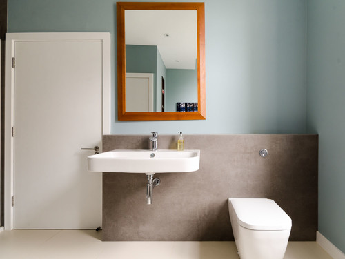
A sparse bathroom can be relaxing: No clutter! Clean lines! But if the look is too bare, you’ll end up with a space that simply doesn’t work for everyday life. Just ask design expert Jessica Filoso, of real estate company CLV Group, who’s seen her share of near-empty bathrooms.
“The main issue with this trend is that you don’t have enough storage,” she points out. “With an overly minimalist design, you end up with all your stuff on the floor, which means your ‘simple look’ is one big mess.”
If your bath is on the empty side, keep buyers’ fears at bay by adding some more storage and personality. Étagères are a perfect spot for towels, toiletries, and tissue paper—and they’re chic and lightweight, too, so you can keep your minimalist theme.
Need more pizzazz? Hang a colorful piece of art, add a textured hamper, or arrange a trio of potted palms or ferns in the corner.
3. Overly funky color schemes
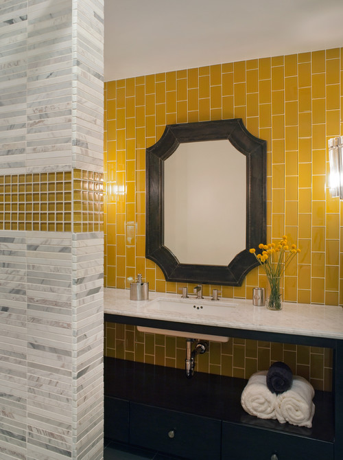
Mustard. Salmon. Avocado. In small doses, they’re nice hues (and delicious foods!). But they aren’t very welcome in today’s powder room.
“Colors like these tend to be tacky-looking and make your bathroom feel like it’s stuck in the 1980s,” says Scott Allis with Miracle Method, a bath and kitchen refinishing company.
A retro look is a fine goal, but when it comes to selling the bathroom, it’s best to stick to a quiet palette—and balance the colors appropriately.
The most appealing, modern look is a mix of three colors in a 70/20/10 distribution.
“Use the neutral one most of the time (70% of the walls, floor, tile), a rich contrasting color for 20% of the look, and then an accent shade for the last 10%,” Heinemann explains.
4. That huge bathtub
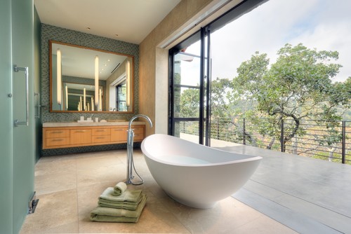
So you’re willing to shell out the dough to update your bathroom before you put your home on the market. Bravo! But when it comes to replacing your bathtub, we have a word of caution: Be realistic.
You might have scoured dozens of design magazines and come to the conclusion that your bathroom won’t be luxurious unless you can soak in a big, beautiful piece of porcelain. But who really has the time?
“This elaborate, oversize fixture is far from practical and actually has low resale value,” Heinemann says.
Indeed, the appeal of bathtubs has declined in recent years. As long as there’s one bathtub in the house (for buyers with kids), there’s no need for more—or a big, ostentatious soaker.
“Homeowners use these tubs once a month, tops,” Heinemann adds.
Instead, put your money into a quality, high-efficiency, water-saving shower.
“And if you really want a whirlpool, put in an outdoor version or an extension of an existing pool,” suggests Bea Pila, design pro and author of “Sacred Spaces for Inspired Living.”
5. Dual sinks
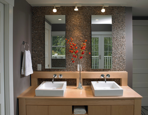
His-and-her sinks seemed like a good idea for a while: She has a dedicated spot for hair and makeup, and he has a personal basin for his shaving and grooming. But after years of carving out space in master baths for two matching sinks, designers and home buyers are backing away from the trend.
“Today most people wish they had more counter space, rather than that second sink,” Heinemann says.
But don’t rip out your two-sink look unless you’re already planning a bathroom rehab.
“Instead, add shelving near the sinks so there’s more storage,” Heinemann advises.
6. Medicine cabinets
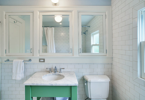
This one might make you pause—home buyers are all about more storage, right? But these mirrored boxes aren’t the way to go about it, says Andrea Stanford, vice president of marketing and partnerships at the online estate sale marketplace Everything But The House.
Yes, open shelving—which has been popular in kitchens for years—is making its way to the bathroom.
“People have beautiful products nowadays, and they want them to be seen and accessible,” Stanford says.
“A more modern storage trend now features plush stacks of towels, beautiful soaps displayed on a tray, and stand-alone vanities for perfume and makeup,” she adds.
As for the stuff you don’t want people to see, add a couple of woven baskets with matching lids.
7. Subway tile and nickel finishes
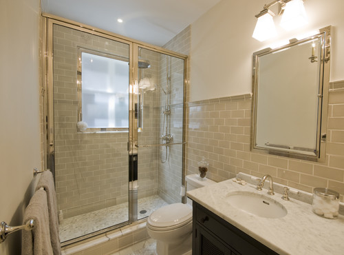
There are some designers who will still install subway tile by default, but this ubiquitous design trend is starting to fade.
“Large-format tile is a good way to go, as are mini mosaics and geometric tiles,” says Nicole Rojas, a decorating guru with Tellus Design in Southern California.
Similarly, when it comes to hardware and accents, cool finishes (nickel and chrome, for example) are taking a back seat to brushed gold and even black, Pila reports.
“The silhouette is still clean and streamlined,” Pila says. “But these newer tones add an element of modernity and sophistication.”
Luckily for you, hardware is quite easy and inexpensive to swap out, so you can give your bathroom a modern makeover in an afternoon’s time.


