Tough Sell: 6 Bedroom Design Trends That Buyers Hate
Tough Sell: 6 Bedroom Design Trends That Buyers Hate
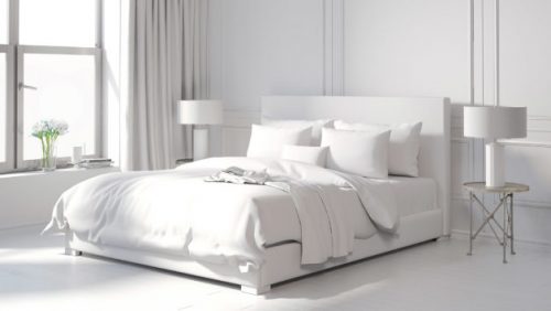
The bedroom is probably the most personal room in your house, and not just because it’s where all (or at least some) of the magic happens. After all, it’s where you snuggle up at the end of a long, cold day; where you retreat when you’re sick; where you stash the items that mean the most to you. Most likely, the decor scheme is also pretty close to your heart.
But when you’re selling your home, as you’ve no doubt heard, personal taste should go out the window. The same goes for distinctive, of-the-moment trends—yes, even if you’re quite sure that eggplant is the new black. Overdoing it with loads of wicker, mountains of pillows, or extra dark paint can send the wrong message about your home, and scare off potential buyers.
That’s because whatever’s hot will someday be … not. Reba Haas, a Realtor® with Re/Max Metro Eastside in Seattle has seen it all.
“Can we please get over the bright colors—pink, lime green—especially in kids’ bedrooms?” she begs. Reality check: Nobody likes these shades that much, and they scream “long weekend of painting” to buyers, unless they have similar tastes.
Here are seven more once-popular ideas that decorating experts wish they could banish from every bedroom:
1. All white, all the time
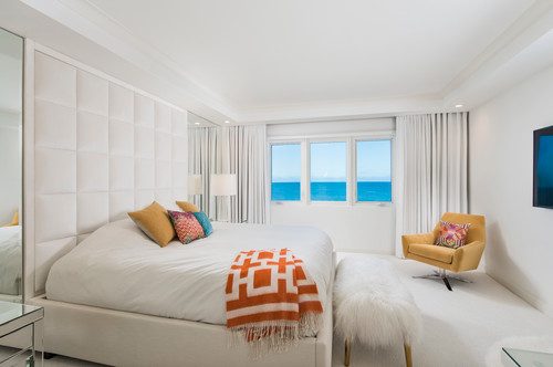
We know, home sellers are often told to stick to a neutral palette, and white is a neutral, but…
“It’s too sterile and harsh on the eyes—which is not the relaxing vibe you want in the bedroom,” says Jamie Novak, an organization and design guru and author of “Keep This Toss That.”
Jeffrey Weldler, marketing director and interior design expert at wall panel company Vant, also wants to soften the edges of this minimalist look, often associated with the Nordic countries.
“Scandinavian styling is an amazing design concept as long as there’s some color included in the room, such as a rug, wall art, or curtains,” he explains. The bright pillows and cozy yet bold throw in the otherwise all-white bedroom above fit the bill nicely.
2. Your ‘reading corner’
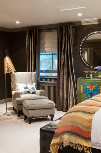
Think that chair in the corner, paired with a leftover floor lamp banished from the living room, adds flair to your bedroom? Nope—in most cases it’s a waste of space that’s actually a way station for clutter, clothes, and the cat. And do you honestly sit there to read? Really?
“This spot is for dumping stuff that tends to pile up faster than you can clear it away,” Novak says. Need a spot to sit? Try a bench at the foot of the bed (one with concealed storage will help tame that clutter, too), or just plop on the bed when you need to put on socks or apply foot cream. Shake up the corner by setting that chair free.
3. Too many shelves, too much stuff
Sure, bookshelves make sense in the bedroom, but entire walls of them is overkill.
“Open shelving can give the room an airy, spacious look, but it often turns into an eyesore due to clutter,” says Novak. Leave just one or two shelves open and arranged (neatly!) with books and other objects—and then fill the rest with baskets and bins for your stuff. Plus, there’s a bonus here: less dusting.
4. Crazy pillow piles
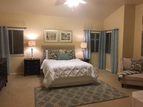
You may think you’re creating an air of luxury with an excess of pillow, but one person’s fluffy extravagance is another’s pet peeve. Control the chaos on your bed by sticking to this golden rule: Don’t have more pillows than you actually use. For most people, this will be the pillow on which you sleep, plus a bolster and/or a square European pillow for reading in bed. Of course, if it’s just you in a giant king, double that for symmetry.
“Decorative pillows that span and cover the whole mattress are just too much,” says Anna Shiwlall, an interior designer at 27 Diamonds in Los Angeles.
“At least use a plain bedspread as a base for all those colors,” says Amber Dias, a Showhomes interior design consultant near Sacramento, CA. She suggests making sure there’s a common color, texture, or fabric tying the elements together.
5. Stark decor
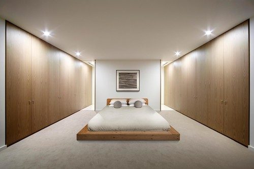
A bed. And that’s it. Yup—minimalism can be taken to the extreme.
“The look should be decluttered and organized, not a space where most of the furnishings have been stripped away,” says Weldler. When it comes to furniture placement, pay attention to the size and scale of your pieces.
“If there’s too much in the room or the bed is too big, the room will feel claustrophobic,” Dias points out. But with too little furniture, you run the risk of making it look like your first apartment after college.
6. Drapes of yesteryear
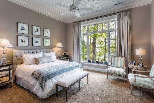
Want to sleep in a dust bowl? Of course not. So get this sneezy look out of the bedroom by nixing thick curtains and other cascading fabric.
“Overly drapey drapes on windows and canopy beds require a lot of vacuuming to keep dust at bay—and you should be concerned about air quality since this is where you sleep,” explains Carol Marcotte, the designing expert at Form & Function in Raleigh, NC. Instead, opt for simple panels, Roman shades, or woven blinds with black-out panels. Your lungs will thank you.
Article found: https://goo.gl/nFB05S
Article by:


